
ABOUT THE PROJECT
A ground-up brand and website for a neuro-affirming children's care provider, built from a single idea surfaced in workshop: belonging.
My Role
Lead Designer
Scope
Brand Identity + Website
Deliverables
Brand Strategy · Visual Identity · Full Website
Markets
Atlantic Canada


Discovery: PARt 1
The engagement opened with a facilitated workshop rather than a moodboard. Two exercises did most of the work.
The Why asked the team to state the problem before stating the service. What came back was blunt. Families were not finding an inclusive space. The most challenging cases were being turned away elsewhere, which made this the last resort, and without it there was nowhere else to go. The core reason was written in one line: children deserve to belong, and someone has to show up for them when no one else does.
Top 3 Values surfaced four natural clusters.
Relationships, family, and friendship.
Playfulness, happiness, creativity, and fun
Care, gratitude, kindness, and inclusion
Reliability, accountability, and learning
The name confirmed it. Carebü carries two roots: Karibu, Swahili for welcome, and caribou, the animal that survives by moving as a herd and leaving no one behind. Welcome and belonging in a single word, arrived at independently of the workshop and pointing to exactly the same place.


Discovery: PARt 2
Carebü's work was already deeply human. The brand was not saying so, and the category was actively working against them. Pediatric care branding tends to fail in two directions: clinical and cold, or infantilized and pastel. Neither respects the parent making a hard decision at midnight, and neither respects the child at the center of it. For a provider positioned as the place families come when they have run out of options, looking like everyone else was a real cost.
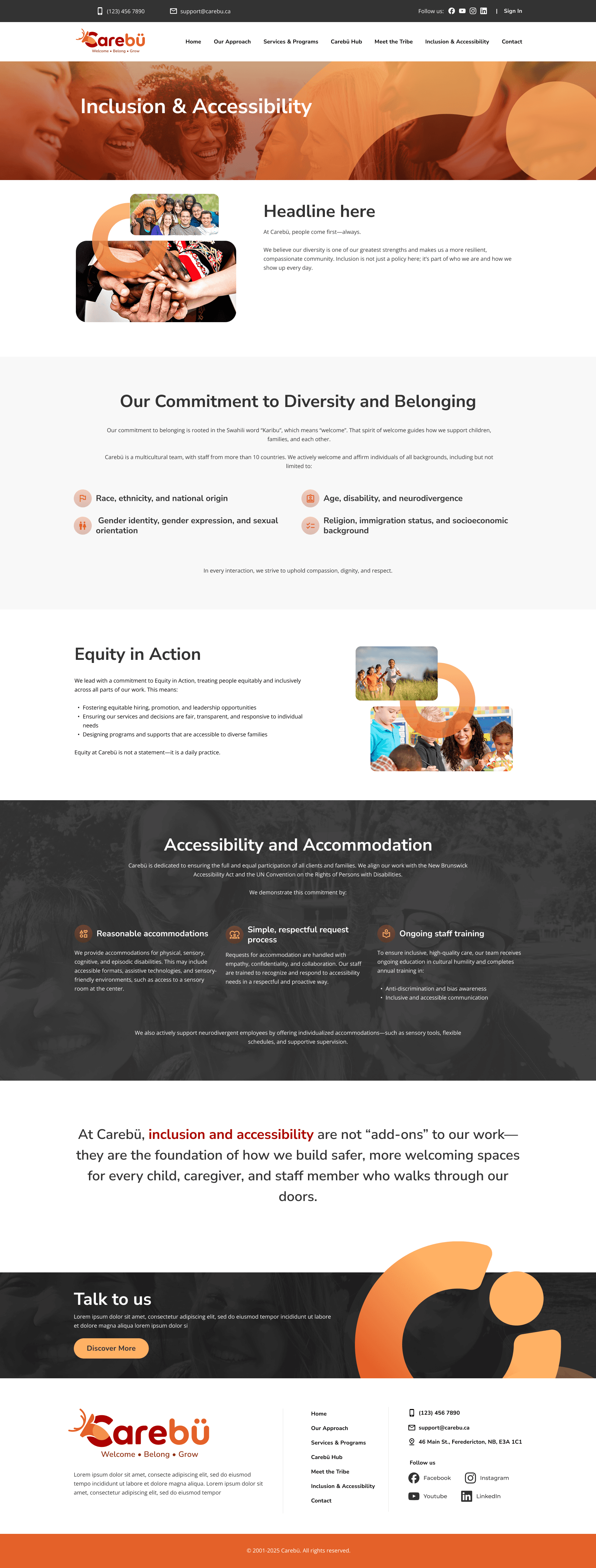
The four value clusters translated into an identity that had to hold two temperatures at once. Warm and playful enough to feel like the cat cafe, credible and accountable enough for a parent handing over their child. Not sweet, not sterile. Accessibility was treated as a design input rather than a compliance pass, shaping contrast, type scale, and the decision to keep language plain across every touchpoint.
Voice was written against the category. No jargon, no deficit language, no promise to fix anyone. Copy speaks directly to the parent, names strengths before needs, and stays honest about what care actually looks like.

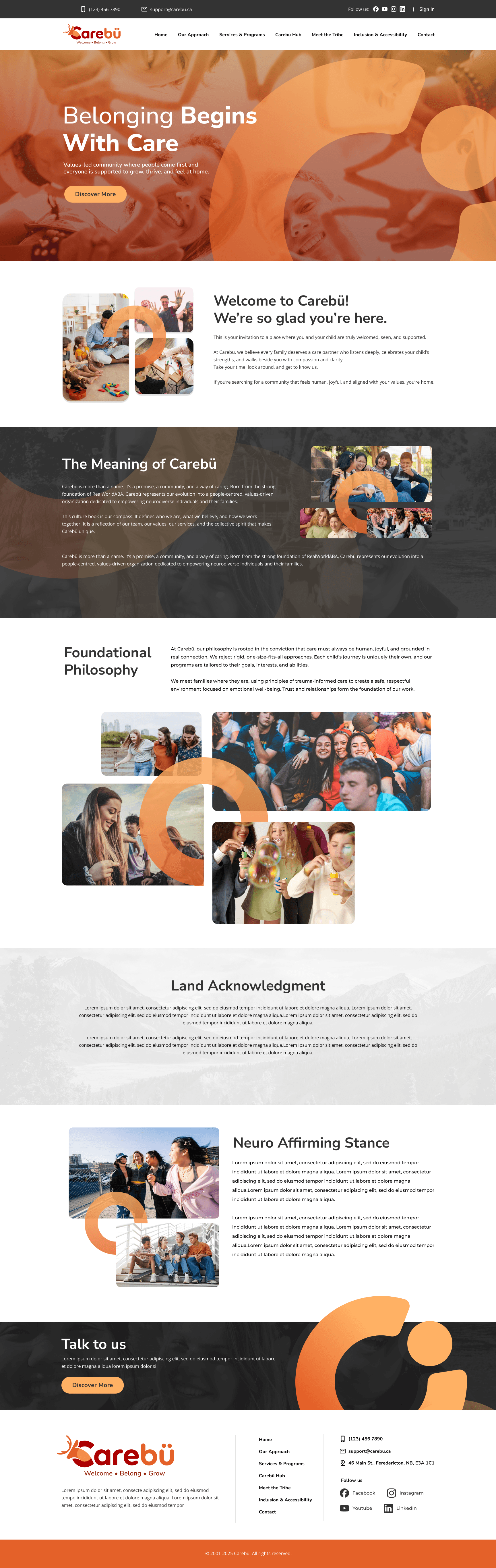
The website turns the philosophy into a path. A parent arriving in crisis needs to know who Carebü is, what they believe, and how to start, in that order and quickly. The site is organized around belief first, services second, contact always within reach. The homepage opens on "Belonging Begins With Care," the discovery word promoted to the first thing anyone reads. The land acknowledgement and inclusion commitments sit in the main navigation rather than the footer, because for this audience they are qualifying information, not decoration.

CLIENT TESTIMONIAL
JP is one of those rare designers who doesn’t just create beautiful interfaces—he creates meaningful experiences. He has an exceptional ability to distill complex ideas into clear, intuitive, and empathetic designs while staying true to the heart of a brand.
What impressed us most was how deeply he invested himself in understanding Carebü’s mission, values, and the people we serve. Every design decision felt intentional, balancing aesthetics, usability, and emotional connection. His work wasn’t just about making something look good; it was about creating an experience that genuinely resonates with families, clinicians, and our community. Beyond his creative talent, JP is collaborative, responsive, and an absolute pleasure to work with. He welcomes feedback, communicates openly, and consistently delivers work of the highest quality.
If you’re looking for someone who can elevate your brand, translate your vision into a compelling digital experience, and lead with both creativity and empathy, I couldn’t recommend JP more highly. He is an exceptional designer and a trusted creative partner.
Asif Hasan
CBO/CTO & Co-Founder, Carebü | CEO, NeuroAI


Next Case Study
© 2025 JP Artacho. All rights reserved.